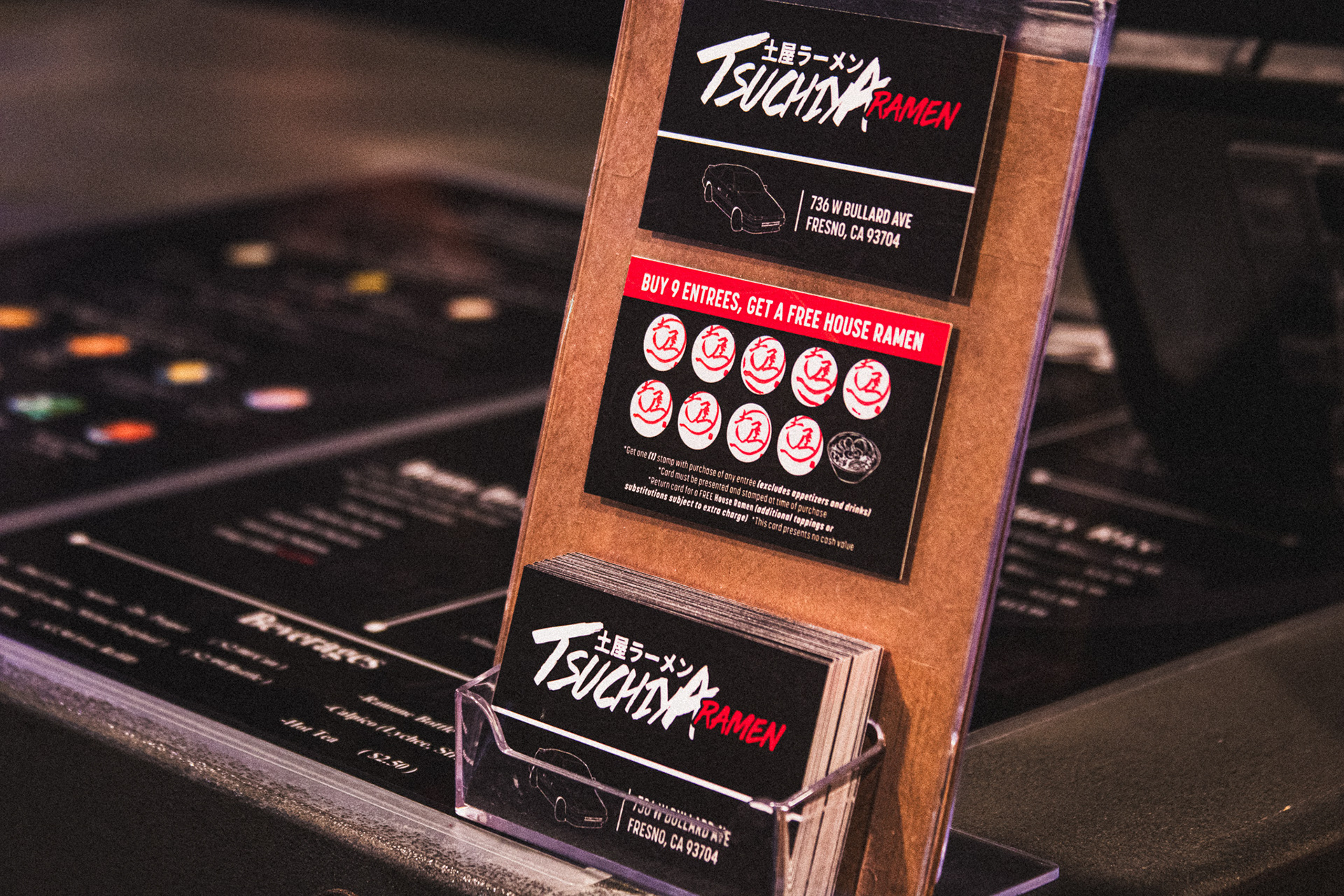
Tsuchiya Ramen needed a refreshed version of their existing customer loyalty stamp card. The goal was to keep the original layout and reward structure intact while updating the font styling and overall visual hierarchy to better align with the brand's growing identity and improve readability.
Objective:
• Typography updates for improved legibility and brand consistency
• Minor alignment and spacing refinements
• Visual polish while preserving original layout
• Easy and visible stamp spots.
• Print setup with bleed and trim formatting
• Final export for both print and internal digital reference
• Typography updates for improved legibility and brand consistency
• Minor alignment and spacing refinements
• Visual polish while preserving original layout
• Easy and visible stamp spots.
• Print setup with bleed and trim formatting
• Final export for both print and internal digital reference
• Illustrator
Medium:
• Printed Cardstock